
Last Updated: November 5, 2026
Quick Summary
To make paint colors match furniture, let the furniture lead: pull three to five colors from your key pieces, note each one's undertone, then choose a wall paint that supports them as a backdrop. Matching undertones is the real secret to coordination, and you should always test samples on the wall before buying a gallon.
- List your key furniture pieces and their colors, note the finish, then pull three to five colors from them.
- Warm undertones lean yellow, orange, or red; cool undertones lean blue, green, or violet.
- Keep a living room palette to three to five colors using the 60-30-10 rule.
- Paint samples at least two feet wide on two walls and check them in morning, afternoon, and evening light.
- Renters can shift color with peel-and-stick wallpaper, slipcovers, and large washable rugs.
Table of Contents
- Start With Your Furniture, Not the Paint Chip
- How to Coordinate Furniture With Wall Color Using Undertones
- Paint Colors for Dark Wood Furniture That Don't Fight the Grain
- Build an Interior Color Combination for Living Room Furniture
- Test Paint Colors in the Room Before You Buy a Gallon
- Use a Room Color Palette Visualizer to Narrow the Shortlist
- Rental-Friendly Ways to Match Furniture and Wall Color
- Download a Designer Palette and Skip the Guesswork
- Frequently Asked Questions
Start With Your Furniture, Not the Paint Chip
The fastest way to make paint colors match furniture is to let the furniture lead. Pull your color cues from the pieces you already own, then choose a wall paint that supports them.
Most people do it backwards. They fall for a paint chip in the store, paint the room, and then discover their sofa looks wrong against it.
Here's the better order:
- List your key furniture pieces and their colors
- Note the finish: wood, fabric, metal, leather
- Pull three to five colors from those pieces
- Choose a wall color that ties them together
That last step is where the magic happens. The wall should be the backdrop, not the star.
Before you start matching paint to furniture, you need accurate measurements of your room and your pieces. Our guide on how to measure a room for furniture covers the footprint basics so nothing gets squeezed.
How to Coordinate Furniture With Wall Color Using Undertones
Undertones are the subtle base colors hiding under the surface color of paint and furniture. A gray sofa can lean blue, green, or purple. A white wall can lean warm yellow or cool blue.
Get this wrong and the room feels off. You can't always say why, but the colors clash. The fix is to identify the undertone of every major surface in the room, then choose a wall paint whose undertone agrees with the majority.
The Three Undertone Families
Every color, whether in paint, wood, fabric, or stone, leans one of three ways:
- Warm: yellow, orange, or red base. Creams, beiges, terracottas, honey oaks, and brass.
- Cool: blue, green, or violet base. Grays, blue-whites, charcoal, walnut, chrome, and nickel.
- Neutral: a balanced mix with no strong cast. True whites, greiges, and mid-tone taupes.
A color can be warm-leaning neutral or cool-leaning neutral. That nuance is where most clashes start.
Read the Undertone of Wood, Fabric, and Upholstery
Here is how to spot undertones on the pieces you own:
- Wood: hold a sheet of pure white printer paper next to it in daylight. Yellow-brown means warm, gray-brown means cool, and a pinkish cast means the finish has a red base. Compare two pieces side by side, because warm and cool wood in the same room is a common source of friction.
- Upholstery: compare the fabric to a pure white cloth in daylight, not under a lamp. Any pink, green, or blue cast is the undertone. If the fabric is a print, squint until the pattern blurs; the color that remains is the dominant undertone.
- Rugs and patterned fabric: find the quietest color in the pattern, the one that fills the background. That is usually the undertone anchor, and it is the safest color to echo on the wall.
Write each one down. You now have a color direction for the room.
What to Do When Undertones Conflict
Most rooms are not perfectly matched, and they do not need to be. A common pattern is to let the largest surfaces agree and treat the outlier as an accent.
Watch out: a paint chip that looks neutral in the store can read strongly warm or cool once it is scaled up on a wall, so confirm the undertone on a large sample before you commit.
Paint Colors for Dark Wood Furniture That Don't Fight the Grain
Paint colors for dark wood furniture work best when they create contrast or echo the wood's warmth. Cool whites, soft grays, and muted greens let dark walnut and mahogany stand out. Warm creams and beiges blend into the grain instead.
Here are pairings that hold up in practice:
| Furniture | Paint Color Direction | Why It Works |
|---|---|---|
| Dark walnut | Cool white or pale gray | High contrast, wood reads rich |
| Mahogany | Sage or muted green | Warm-cool balance |
| Espresso | Warm cream | Softens the heavy tone |
| Dark oak | Soft blue-gray | Calms the orange cast |
Watch out: a bright white next to very dark wood can look harsh in low light. Test it on the wall first.
Build an Interior Color Combination for Living Room Furniture
An interior color combination for living room furniture starts with three roles: a main color, a secondary color, and an accent. The main color covers most of the room, the secondary supports it, and the accent adds pop. Keep the whole palette to three to five colors so it stays cohesive.
The 60-30-10 Rule in Practice
The 60-30-10 rule splits a room's colors by share:
- 60%: walls and large pieces, usually a neutral
- 30%: secondary color in upholstery or a rug
- 10%: accent color in pillows, art, or a lamp
Say your walls are warm white. Your sofa is a muted gray-blue. Then your accent could be a rust throw or brass lamp. The palette feels intentional because each color has a job.
Using the color wheel helps here. Analogous colors sit side by side and feel calm. Complementary colors sit opposite and add contrast. Pick one relationship and stick with it.
Japandi Living Room | Ma Negative Space →
Once your colors are set, you still need to place the furniture. Our guide on how to arrange furniture in an open concept living room shows how to lay out the pieces so the palette reads as one room.
Test Paint Colors in the Room Before You Buy a Gallon
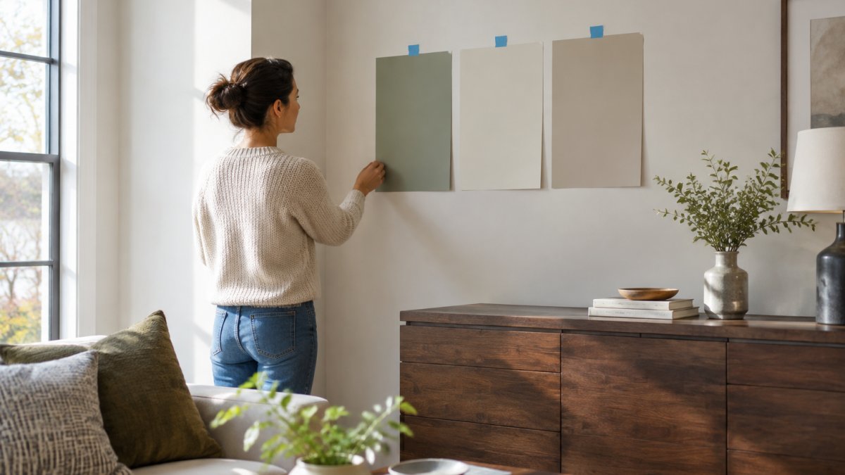
Always test how your paint colors match furniture in the room before buying a gallon. Paint a large sample on the actual wall and check it at different times of day.
Here is a sampling workflow that covers the variables:
- Buy small sample pots of your top three colors. Most paint brands sell sample sizes for a few dollars, which is far cheaper than a gallon you regret.
- Paint large squares, at least two feet wide, directly on the wall. Small chips are useless because the surrounding wall color and the room's light overwhelm them.
- Paint the samples on at least two walls, ideally one that faces a window and one that does not. The same color will look different on each.
- Check them in morning, afternoon, and evening light, and again at night with your actual lamps on.
- Look at them next to your furniture, not just alone. Hold a pillow or a wood sample against each patch.
- Note which undertone wins in each light, and write it down so you are not relying on memory.
How Room Orientation Changes Paint Color
Room orientation matters more than most people expect. North-facing rooms get cool, indirect light all day, so warm tones help balance the chill. South-facing rooms get warm, direct light and can handle cooler colors without feeling cold. East-facing rooms are warm in the morning and cool by afternoon, and west-facing rooms do the reverse. If your room gets strong afternoon sun, a color that looks calm at noon can turn intense by four o'clock.
How Bulb Color Temperature Changes Paint Color at Night
Bulb color temperature changes everything after dark. Color temperature is measured in kelvin: around 2700K is warm and yellowish, 3000K is soft white, and 4000K and above is cool and bluish.
Watch out: testing only in bright midday sun can hide the muddy or overly warm shift that shows up in the evening under lamps.
For more color-picking tips, see our interior design advice and tips collection.
Use a Room Color Palette Visualizer to Narrow the Shortlist
A room color palette visualizer is a tool that shows colors side by side before you commit. It helps you see how a wall color, sofa tone, and accent play together. Use one to cut your list from ten options to three.
Try this sequence:
- Upload or enter your furniture colors
- Generate a few palette options
- Save the ones that feel calm and cohesive
- Take the top three to your paint samples
A visualizer won't replace testing on the wall.
If you want a guided shortcut, our Style Quiz points you toward a palette that fits your taste before you buy anything.
Rental-Friendly Ways to Match Furniture and Wall Color
Renters can still match furniture and wall color without picking up a brush. Removable peel-and-stick wallpaper, large washable rugs, and slipcovers let you shift the room's color story without permanent changes. Landlords rarely object to these.
Low-commitment options that work:
- Peel-and-stick wallpaper on one accent wall
- Removable wall decals for art and pattern
- Slipcovers to change sofa or chair color
Pick a neutral base that suits the existing wall color, then layer the accent through fabrics. When you move, the palette comes with you.
Download a Designer Palette and Skip the Guesswork
The hardest part of matching paint to furniture is confidence. You can read every guide and still second-guess the final call. That's the gap a pre-built palette fills.
SpaceKits offers downloadable room templates created by licensed interior designers. Each kit includes floor plans, color codes, and clickable shopping links.
Living room kits include:
- Japandi Living Room | Ma Negative Space ($22.00): a living room built around negative space
- Quiet Luxury Living Room | The Still Room ($22.00): an edited luxury living room
- Mid Century Modern Living Room | The Living Machine ($22.00): a mid-century modern living room
Each kit gives you a coordinated color direction, so you skip the guesswork and get straight to planning. For more ready-made palettes, browse our interior design templates for home styling.
Frequently Asked Questions
Should I choose paint or furniture first?
Choose furniture first when you already own pieces you plan to keep, because replacing a sofa or dresser costs far more than a gallon of paint. Pick the paint colors that match furniture you love, then build the room around them. If the room is empty, start with the largest piece you plan to buy, such as a sofa or bed, and pull the wall color from its undertone. Starting with paint usually leads to furniture that clashes with the walls.
How do I test paint colors in a room before painting?
Paint large samples, at least 12 by 12 inches, directly on the wall in two coats, then look at them at three times of day: morning, mid-afternoon, and after dark with lamps on. Put samples next to the furniture and textiles they need to match, not on a bare white patch. Paint dries darker than it looks wet, so judge the dry result. Peel-and-stick samples work if you place them the same way.
What paint colors go with dark wood furniture?
Warm whites, soft creams, sage green, muted blue, and greige pair well with dark wood because they keep the contrast readable without competing with the grain. Avoid stark cool white and very yellow creams, which can make dark wood look orange or muddy. Check the wood's undertone first: reddish mahogany wants warm neutrals, while espresso or walnut reads cooler and suits gray-green and soft blue. Test samples beside the piece before committing.
Can a room color palette visualizer help me choose paint colors?
A room color palette visualizer helps you see how a wall color, upholstery tone, and accent shade sit together before you spend money on paint or furniture. Upload a photo of the room, drop in candidate colors, and check whether the palette reads cohesive or jarring. Use it to narrow the shortlist to two or three options, then confirm with real paint samples on the wall. The visualizer speeds up the decision but never replaces testing in the actual light.
Matching paint to furniture doesn't have to be a gamble. Start with your furniture, read the undertones, test on the wall, and lean on a designer palette when you want certainty. SpaceKits gives you licensed designer plans with color codes, mood boards, and shopping lists, all in one instant download. Explore SpaceKits and pick a palette that makes your room feel finished.
